Around the world finance teams use Excel to analyse an organisation’s P&L aiding in important business decisions - the challenge is how to engage with the same audience, to analyse their own P&L and understand the data in a simple and multi-platform model. Using the advancements in Power BI financial reporting, visualising your P&L is now easy to implement and manage.
In this blog, I have identified 5 key steps to an engaging P&L, these are:
1. Dates table
2. Excel Logic
3. DAX Measures
4. Visuals and Formatting
5. Benefit Realisation
Step 1 - Dates table
Analysing data from a source system in Excel is great, however there are many times when we want to make the data come alive and give the users a way to compare previous years or drill down to their values. In Power BI it is possible to do all this and more. To achieve this we need to make sure the model is built with a Dates table, this could be within a connected model or in Power BI. If there is one in the model to ingest, great, if not one can be created with the click of a button and some DAX. In my experience working with data a Dates table is pivotal, I was not aware how vital this would be for Power BI. Most financial data will need a prior year comparison at some point and Power BI does this well, only it needs a dates table to work. This could be a real pain point, but is easy to resolve.
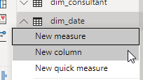
Go to the modelling ribbon, find a new button called “New Table”, then paste the code in below.
Date =
ADDCOLUMNS (
CALENDAR (DATE(2015,01,01), DATE(2030,12,31)),
"DateAsInteger", FORMAT ( [Date], "YYYYMMDD" ),
"Year", YEAR ( [Date] ),
"Monthnumber", FORMAT ( [Date], "MM" ),
"YearMonthnumber", FORMAT ( [Date], "YYYY/MM" ),
"YearMonthShort", FORMAT ( [Date], "YYYY/mmm" ),
"MonthNameShort", FORMAT ( [Date], "mmm" ),
"MonthNameLong", FORMAT ( [Date], "mmmm" ),
"DayOfWeekNumber", WEEKDAY ( [Date] ),
"DayOfWeek", FORMAT ( [Date], "dddd" ),
"DayOfWeekShort", FORMAT ( [Date], "ddd" ),
"Quarter", "Q" & FORMAT ( [Date], "Q" ),
"YearQuarter", FORMAT ( [Date], "YYYY" ) & "/Q" & FORMAT ( [Date], "Q" )
)
This will create a table of dates (from 2015 to 2030) and fiscal period columns to aid in report design later. Next join this up to your source data in the model. Link on Date from the Date table to the Date in the source data.
Step 2 – Excel Logic
In Excel we all have a few favourite formulas, which we usually apply to source data, either formatting or changing. It is important to write these down and apply these to our Power BI model. Go to the table we need to add the information and create a column or a measure.
A column could be a function such as Left () or Replace. A Measure is an aggregate function. For example, if I want to report on Total Net, I will need to do the following in DAX, Total Net = sum(Gross) – sum(Tax).
Once all the columns/measures have been created we can move onto more complex DAX.

Step 3 – DAX Measures
One of the main financial data points is to compare current year to prior year. This can be done in DAX using a function called Same Period Last Year. To use this, Power BI requires a dates table, hence why step 1 is vital to the model. The prior year function uses the dates table to look back and return a value, for example Net Value. In DAX this would be as simple as:
Net Value PY = CALCULATE(SUM(TableName[Net Value]), SAMEPERIODLASTYEAR(Date[Date]))
More information on this can be found here.
This new PY value can now be charted with other values to show future months’ comparable values:
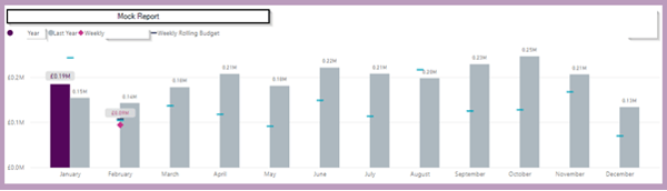
Step 4 - Visuals and Formatting
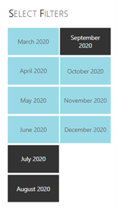
Adding various filters to the report page will allow the user to easily switch between numerous activities such as Vs Budget, Vs Prior Year or even through historical time frames (Annually, Quarterly or Monthly).
Adding filters to the page will aid with this, for example a monthly slicer can help people understand what they are seeing. Filters can be both single page or synced at report level. If applied at page level, then only that page will change, if applied at report level, then all the pages on a report will filter at the same time. This means that users won’t need to make the same changes to each page to see their data. With P&L broken down over multiple pages this could save a user a lot of time and also reduce errors.
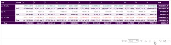
Deciding on the right visual to entice users to explore the data is key on P&L, one of which is a matrix table. Building the data into a Matrix table visual will allow you to add in various Hierarchies such as Expenses or Revenue then broken down into their respective headers. With a Matrix Visual you can easily drag and drop the values required against any of the hierarchy’s classification levels. This will allow each user to access the most relevant data to them.
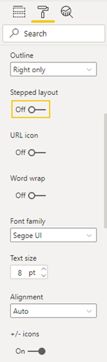
Once created and populated it is essential that the Format is on brand and made to look the best it can. Working through each item will turn numbers into an appealing data set for the user, adding in conditional formatting will enrich the set. There are various options in the layout pain. Style will let you add colour to the headers and row alternatives.
To detail values in a table, you can use Conditional formatting, this follows similar rules to Excel, based on values or rules such as below zero change to red. The following layout changes help to present the data in a clear visual way:
The results detail the data in the following way:
The steps outlined above will help to enhance a P&L in Power BI and give users the ability to filter for the data they need with ease. The data is also available online for all to access and is rendered ready to read on a tablet or phone. Detail pages can be created, which will hold the granularity of the data, these can be hidden from sign but accessed through a feature called Drill Through. This will allow the user to click on the data they want and drill to the detail. This can then be exported to other applications if required.
Step 5 - Benefit Realisation
Once the P&L is embedded in Power BI it is now time to reap the rewards. The argument of Power BI vs Excel is one which will go on for many years to come, they both have fantastic functionality; however, Power BI has a few integrated features which could sway your decision.
Once a report has been created it can then be published to Power BI online - to one of many workspaces from within an organisation. Each user will have their own workspace (a sandbox area where only you can see a report) or a workspace can be created, and members added to it. Thus keeping the data secure to the target audience. There is no need to password protect a file or put it on a share where everyone has access, the workspace has the members, and they can be added or removed with a few clicks.
If you want to bring the workspace to life then a Power BI App can be created, an App is easy to create and allows for a hierarchy layout structure to put reports in the correct place. A revenue folder, for example, will hold revenue reports, and a sales folder will contain sales reports. This will help guide the users to the correct section, which is far easier than navigating through folders on a share. An App can have a logo and a theme; it can be kept on brand to an organisation or a team. Similar to the workspace, users can be added to an App.
Power BI also features user roles. A role can be created, and users added to that role, so they only see what they need. This is particularly helpful for a worldwide organisation, where roles can be set up per country and users of each country then added. Keeping each country’s data to themselves.
The beauty of Auto Refresh! Come month end, Financial reporting can be a very busy period and Power BI can help to give you the data you require without manual intervention. Once a report has been published online, an auto refresh can be scheduled in. A report contains both the visual report and a dataset, the dataset can be automatically refreshed multiple times per day if required. This could be set hourly so that once the data in a model (or local file) has been updated the Power BI will be refreshed with the latest data without having to do anything.
https://docs.microsoft.com/en-us/power-bi/connect-data/refresh-scheduled-refresh
Another big win for Power BI vs Excel is the ability to create Dashboards. These can hold visuals from many different reports to give a “view from the bridge” for high level users who don’t require granularity of a report. The dashboards are interactive and allow a user to click through to the source report for any relevant detail.
Reporting in Power BI aids in organisational standards and branding awareness. Backgrounds can be set in templates to hold such things as logos, images, and a colour theme, many are built in but can be created with a simple JSON file. This will help build confidence as aesthetically all the reports follow the same principles with the differences being the content.
Another win in the Power BI vs Excel duel is that reports can be shared online to anyone with an email address, those users can also interact with others using the comments feature.
A side pane allows users to ask questions or comment on reports, also tagging people so that they are notified of a question. This aid is a simple turnaround of Q&A and removes the email chain of questions from an Excel report, this will help collaboration in the business and improve communication.